Evading detection and building trust with Captcha challenges and Smishing attacks.
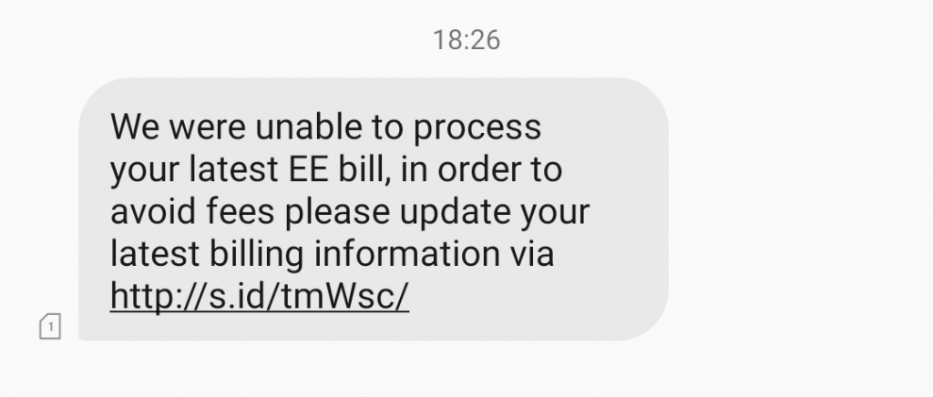
This week I received another SMS Phishing attack which was almost identical to the previous Smishing attack covered. There were two things that struck me as particularly interesting this time:
- The attack used the s.id Indonesian link shortening service
- The attack used a Captcha page to limit access to the phishing page to real people only
Thinking about the first point, it’s clear that s.id, the “World’s shortest URL shortener”, has been chosen to minimise the size of the links in the phishing text message. I would guess that they’re also not particularly quick about removing malicious links (but I could be wrong).
The second point, the use of a Captcha form after clicking on the link in the text message, is interesting to me in three ways.
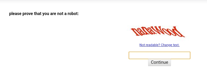
1. Using Captcha to Block Malware Detection
Without a doubt, preventing the automatic detection of the phishing page on the website is the primary reason for hiding it behind a Captcha challenge.
Captcha is almost short for ‘Completely Automated Public Turing test to tell Computers and Humans Apart’. This is a convoluted way of saying ‘if you can read this sign you’re a human and I’ll let you in.’ The premise is that computer image recognition is still not good enough to accurately decipher the words in the image and therefore only people can pass the test.
What that means for automated malware scanners is that they can’t see the phishing pages that innocent people are being sent links to.
Automated Phishing Site Detection
There are a lot of people trying really hard to detect and block phishing pages in as many places as possible before they cause actual people actual harm. Tools such as Microsoft ATP and Google Safe Browsing to name just two automatically fetch and scan web pages and score them against a constantly evolving set of rules in order to determine if they’re real or fake.
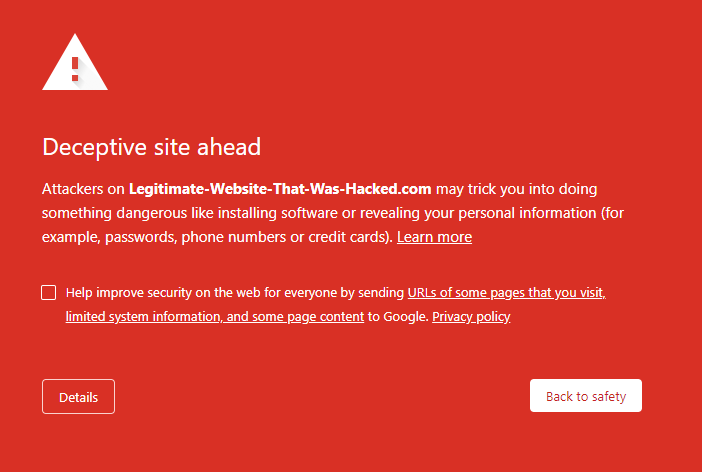
When a malicious website is detected it is added to the naughty-list and any time someone tries to access that site it is either blocked or they are shown a warning message like this:
Phishing sites usually run on commodity phishing kits – pre-packaged software bundles designed specifically for stealing and saving sensitive information without getting caught. As they’re so widely and consistently used, they’re really easy to detect. When a website has replica EE branding all over it and it isn’t the real EE domain, it’s obviously a fake site.
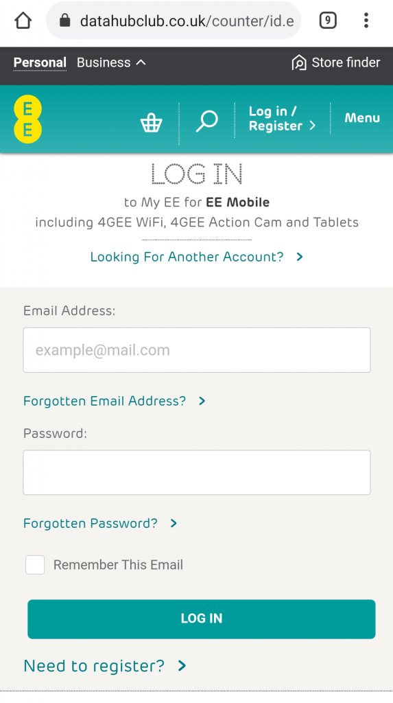
By hiding the phishing kit behind a Captcha page it prevents automated scanners from analysing it. This means they can’t be automatically added to the naughty-list and users could be Captcha-ing themselves into an unsafe site without realising it.
As soon as a user sees a warning message like the one ‘Deceptive Site’ one above, it’s usually game over for that particular phishing attack. Staying under the radar by evading detection means that once the user passes the Captcha challenge, there’s a high probability of a successful phish attack being completed.
2. Captcha as an Accidental Credibility Indicator
As a weird byproduct of blocking automated scanners, adding a Captcha page gives a phishing site a weird sense of credibility in the eyes of some users. Most of the time, when we see Captcha forms, it’s to protect something we care about from harmful robots. For example, Captcha is used to prevent bots from brute-forcing our passwords and gaining access to our online accounts.
When we see Captcha forms we have a habitual response to trust what they’re doing. It’s not particularly strong, but it’s there. For many, the context within which it appears will be enough to override any sense of ‘this is fine’. Some of the less cyber-aware people on the internet won’t see what we see. This is the target market for a phishing campaign like this.
3. It Isn’t Even Mobile-Ready!
This is the bit I find the most infuriating. The attack could have been so much better but it let itself down!
The phishing or smishing attack was delivered by text message directly to my smartphone. It’s a mobile-only attack vector and yet the Captcha part of phishing kit isn’t even mobile ready!
While I cropped the image to make it readable in the earlier screenshot, I left the alignment and spacing as is. In fact, on my smartphone it actually looked like this:
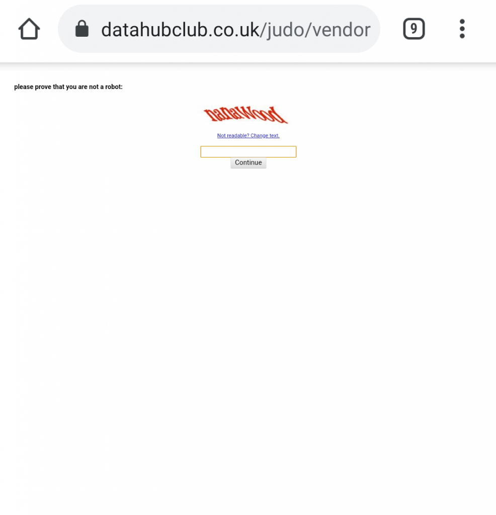
Look how small that is!
It baffles me how attackers can be so on-the-money about one thing such as evading automatic detection and yet be clueless about how the attack is presented to the end-user. Had this been mobile-ready with a responsive layout that matched the shape and size of the screen, this entry point would have been so much more effective.
We can see that attackers and their tactics are evolving and improving over time. Next time the Captcha form might be better integrated. Next time they might even attempt to fake ‘Multi-Factor Authentication’ me since they already had my phone number to begin with. All I know is that they’re willing to experiment and get creative about future attacks in order to increase the likelihood of a payout as much as possible.
Also, Sorry DataHubClub!
(It looks like your CMS was compromised and used for this attack. I hope you get that sorted quickly. From Googling the name and domain, I suspect it’s just a dead DNS entry that’s pointing to a cloud server that someone has spun back up and taken advantage of. You’ve probably not been hacked at all… but who knows…)
Leave a Reply